
HR consulting, assessment & training
Apex Consulting — HR assessment and training dashboard
We built an internal web application for Apex Consulting that brings assessment analytics, projects, the team, a competency library and a report archive into one dashboard.
- Client
- Apex Consulting
- Year
- 2025
- Services
- Web application
- Tech stack
- Next.js, TailwindCSS, shadcn/ui
Results
- module pages in one app
- 9
- charts on the analytics page
- 6
- display themes: light and dark
- 2
- faster monthly reporting
- 30%
The challenge
Apex Consulting runs three service lines: assessment, training and HR consulting. Each one produces its own data, from the number of candidates assessed and their scores to training programme status and project value per client.
Before this project, that data lived in separate spreadsheets and folders. Answering a simple question, such as how many candidates were assessed this month or which programme is most in demand, meant combining several files by hand.
Assessors also needed a shared reference. Competency definitions, expected levels and assessment methods had to be consistent, so that reports from different assessors could still be compared.
Our approach
We began by mapping what each role needs: directors who watch the numbers, assessors and trainers who work with candidates, and the operations team that runs projects. The result is a sidebar with two groups. The first covers daily work: Dashboard, Analytics, Projects and Team. The second, Knowledge Base, holds shared references: Competency Library, Performance Reports, SOP Library and Training Materials.
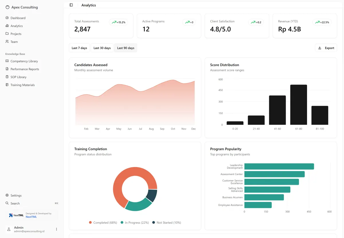
We kept the interface calm, with a white background and dark text, so the charts take centre stage. Three colours are used consistently for the three service lines: orange for assessment, teal for training and dark navy for consulting. Every list page follows the same pattern of search, filter, export, add and pagination, so staff learn it once and can use every module.
The app is built with Next.js, Tailwind CSS and shadcn/ui. We chose shadcn/ui because its component code is copied into the project instead of being installed as a closed package. Apex Consulting owns all the code behind its tables, dialogs and charts, and can change it without depending on a third party. The ⌘K quick search and the light and dark themes use the same component set.
The solution
The result is an internal web application with nine module pages. The Analytics page shows four summary cards and six charts: monthly candidate volume, score distribution, training completion, most popular programmes, revenue by service line and client retention. Data can be viewed for the last 7, 30 or 90 days, then exported.
The operations team manages projects with service type, status, dates, value and the person in charge. Assessors work from one competency library, with levels from 1 to 5 and assessment methods, and keep reports marked draft or final that can be viewed and downloaded from one place.
What we built
- Analytics page with 4 summary cards, 6 charts and a 7/30/90-day filter
- Project table with service type, status, dates, value and owner
- Team directory in card or list view, filterable by department
- Competency library with category, levels 1–5 and assessment methods
- Report archive with draft or final status, plus view and download actions
- ⌘K quick search across pages, documents and team members
- Settings for profile, light/dark theme, compact mode and email alerts
- Data export on every list page
Scope
- Role-based requirements mapping
- Navigation & workflow structure
- UI/UX design
- Data visualisation
- Component system with shadcn/ui
- Next.js web application development
- Handover & user guide
Screens
/ 9
Next project
NARA — online store for artisan furniture
Tell us about your business.
We will help you pick the first step.
Free, no strings attached. We reply the same day.