
Technology & IT consulting
HORIZONS — company profile website for a technology firm
A one-page company profile website for a technology services firm: four service lines, a project showcase, testimonials and a contact form in a monochrome look.
- Client
- HORIZONS
- Year
- 2024
- Services
- Company profile website
- Tech stack
- Next.js, TailwindCSS, React
Results
- sections on one page
- 10
- service lines
- 4
- showcased projects
- 6
- forms: contact & newsletter
- 2
The challenge
HORIZONS offers organisations four service lines: AI and machine learning, cloud architecture, IoT and cybersecurity. None of them is easy to show. There is no physical product to photograph, and the jargon quickly loses prospective clients.
Technology company websites also tend to look alike: blue gradients, circuit illustrations and similar claims. HORIZONS wanted to look different and calm while still answering what decision makers ask: what do you do, for which sectors, and how do we start a conversation.
They also needed two ways to collect contacts: a form for prospects who are ready to talk, and an email sign-up for visitors who only want to follow HORIZONS for now.
Our approach
We used the first workshop to list visitor questions in order, from “who are you” to “how do I reach you”. That order became ten sections on one long page: opening, mission, services, why choose us, projects, industry figures, testimonials, a closing statement, newsletter and contact. The top menu needs only three links, About, Services and Work, because everything else is a scroll away.
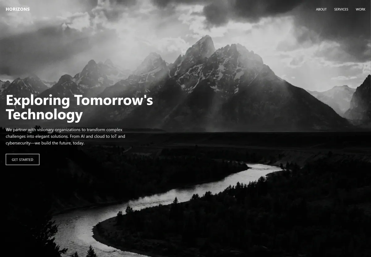
For the visual direction we chose black-and-white photography: mountains, concrete architecture and light trails. It replaces the usual technology illustrations and sets a calm tone. Dark photo sections alternate with open white ones, so readers can tell when one topic ends. Each service card carries a line icon and one industry figure, and the figures block lists its data sources so the claims can be checked.
We built it with Next.js, React and Tailwind CSS. Next.js prepares the page as HTML up front, so search engines can read the content and it appears without waiting for scripts to load. Service cards, project cards and figure blocks are reusable React components, and Tailwind CSS keeps spacing and type sizes consistent across the page.
The solution
HORIZONS now has a one-page company profile website that takes visitors from the company's mission to its four service lines and six projects across sectors, then to a contact form. The form asks for name, email, phone, company and subject, with contact details alongside.
An email sign-up above the contact form gives visitors who are not ready to talk another option. The footer wraps up with company and solution links and the HORIZONS name set in very large type.
What we built
- Full-screen opening with monochrome photography and a Get Started button
- Four service cards with line icons and one industry figure on each
- Showcase of six projects, each labelled by sector
- Industry figures block with its data sources listed
- Client testimonials in a slider with previous and next buttons
- Email newsletter sign-up for technology news and research
- Contact form with a contact details card alongside
- Three-link menu that jumps to About, Services and Work
Scope
- Discovery workshop
- Information architecture
- UI/UX design
- Photo curation & art direction
- Next.js development
- SEO setup & launch
Screens
/ 10
Next project
Entra Sinergy Asia — company profile website for a commodity trader
Tell us about your business.
We will help you pick the first step.
Free, no strings attached. We reply the same day.