
Creative & digital design agency
Ripple — motion-led website for a creative agency
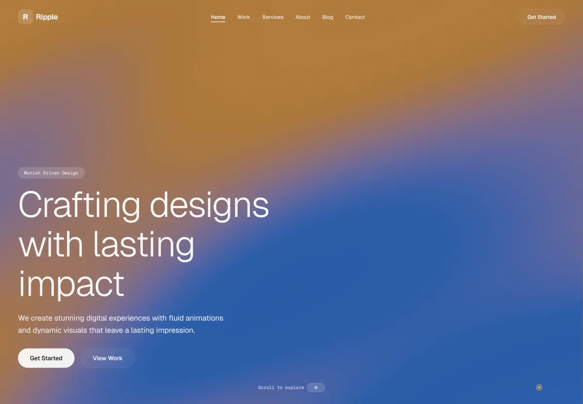
We built a single-page website for creative agency Ripple: a gradient that shifts as you scroll, GSAP animation and a menu that highlights the section you are reading.
- Client
- Ripple
- Year
- 2024
- Services
- Company profile website
- Tech stack
- Next.js, TailwindCSS, GSAP
Results
- content sections on one page
- 10+
- main navigation links
- 6
- accordion FAQ questions
- 5
- longer average visit time
- 25%
The challenge
Ripple is a creative agency that sells motion-led design. Prospective clients judge Ripple's skills by Ripple's own website. If the animation stutters or the page opens slowly, that first impression is hard to win back.
There was also a lot to show: featured work, process, capabilities, a gallery, testimonials, the studio story, client logos, blog articles and an FAQ. Ripple wanted all of it to read as one story rather than a stack of separate pages.
The real task was balancing motion with readability. The animation had to feel alive on a large screen, while the text stayed easy to read and the page stayed light on a phone.
Our approach
We started by reviewing Ripple's work and the questions prospects usually ask before contacting an agency. From there we built a single scrolling story: work first, then process, capabilities, client proof, articles and the FAQ. The main menu stays at the top and highlights the section being read, so visitors always know where they are.
Visually, we chose one warm orange-to-blue gradient that drifts slowly as you scroll. Each section gets its own mood without hard dividers. Large headlines use a light sans-serif, paired with small typewriter-style labels such as “/ How we work”. The work and process lists alternate left and right to keep the reading rhythm varied, and a ring-shaped cursor gives quiet feedback as the mouse moves.
We built it with Next.js so the page opens quickly, and used Tailwind CSS to keep spacing and type sizes consistent across every section. For animation we chose GSAP, because it gives precise timing control for effects tied to scroll position. We checked every effect on phone screens so the motion stays smooth and the text stays legible.
The solution
The result is a single-page website with more than ten sections in one continuous scroll. Visitors see featured work, a three-step process, four capabilities, a gallery, testimonials, a short studio profile, client logos, recent articles and the FAQ without changing pages.
The Get Started button stays visible in the top-right corner. The opening section and the studio profile both offer a clear next step, View Work or Start a Project. Ripple now has a website that demonstrates its motion skills directly to every visitor.
What we built
- Orange-to-blue gradient background that shifts as you scroll
- Sticky main menu that highlights the section being read
- Custom ring-shaped cursor that follows the mouse
- Numbered featured-work list with category and year
- Three-step process and four capabilities in a staggered layout
- Visual gallery, testimonials, studio stats and a client logo grid
- Blog article list with category and publish date
- Accordion FAQ with five questions
Scope
- Research & content strategy
- Single-page structure
- UI/UX design
- Motion design & scroll animation
- Next.js development
- Cross-device testing
- Launch & handover
Screens
/ 10
Next project
Frameon — website for a 3D visualisation studio
Tell us about your business.
We will help you pick the first step.
Free, no strings attached. We reply the same day.