
Consumer electronics & lifestyle
Serene — online store for nature-inspired tech
We built Serene's online store in React: a catalogue filtered across four categories, brand stories about materials and calm, and an editorial Journal in one place.
- Client
- Serene
- Year
- 2025
- Services
- Online store
- Tech stack
- React, TailwindCSS, Vite
Results
- product categories
- 4
- main sections
- 3
- of visitors open a Journal article
- 18%
The challenge
Serene designs audio gear, smartwatches, phone accessories and home devices in sandstone, untreated aluminium and organic cotton. Their principle is simple: technology shouldn't feel like technology.
That kind of product is hard to sell on a general marketplace. There, Serene sits next to hundreds of cheap gadgets, gets judged on spec tables, and the story about materials disappears between discount banners. Shoppers see prices from a few hundred to over a thousand dollars with no reason attached.
Serene needed a store of its own. A place where products, brand story and editorial writing live together, and where the experience feels as calm as the products.
Our approach
We read through Serene's brand material first and turned it into design rules. Warm cream and deep charcoal as the base, a serif for headlines, muted nature photography and plenty of empty space. Their products have no blinking lights, so the website has no animation competing for attention either.
We kept the structure short: Shop, About and Journal, with a cart that's always visible top right. The catalogue uses four category filters (Audio, Wearable, Mobile, Home) above the product grid, because the range doesn't need a heavy filter panel yet. The brand story is split into the studio, Materiality and The Ecosystem, with photos and text alternating side by side.
For the build we chose React with Vite. Switching categories is instant with no page reload, and the bundle stays small. Tailwind CSS keeps colours, spacing and type sizes consistent across every section.
The solution
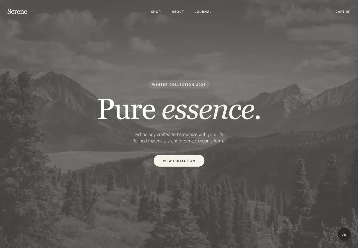
Serene's store opens on a full-screen image labelled Winter Collection 2025 and a single button to the collection. From there, visitors can sort products by category, read about the studio and its materials, and move on to the Journal, where each article carries a date and a short summary.
A floating AI assistant button sits in the corner of every page, and the translucent top menu stays in view as you scroll.
What we built
- Full-screen opener with a seasonal collection label and a link to the catalogue
- Catalogue filters for Audio, Wearable, Mobile and Home
- Product cards with name, category and price
- Cart counter that stays visible in the top menu
- Brand story sections: the studio, Materiality and The Ecosystem
- Editorial Journal with dates, headlines and short summaries
- Floating AI assistant button on every page
- Translucent top menu that stays in view while scrolling
Scope
- Brand research
- Site structure & catalogue
- UI/UX design
- Visual direction & typography
- React development
- Editorial Journal
- Basic SEO
- Launch & support
Screens
/ 6
Next project
FORMA — online store for modern furniture and decor
Tell us about your business.
We will help you pick the first step.
Free, no strings attached. We reply the same day.